

When Patterns Dream of Childhood: A Meeting with Julie and Mélissa
How did the meeting with Charlie Crane come about?
Julie: Alongside our Season Paper brand, we have a pattern design studio where we create print collections for other brands. We've therefore been crossing paths for a long time at trade shows with Thomas (Editor's note: the founder of Charlie Crane).
Thomas: Season Paper is a brand I have admired since its early days. I have always been drawn to their universe — at once poetic and graphic — which resonates perfectly with our vision at Charlie Crane. We share the same love of beautiful materials, the same commitment to responsible production, and the same ambition to create products made to last. This collaboration naturally presented itself as a meeting of shared aspirations and values.
 How did you adapt and choose your pattern for the Charlie Crane furniture?
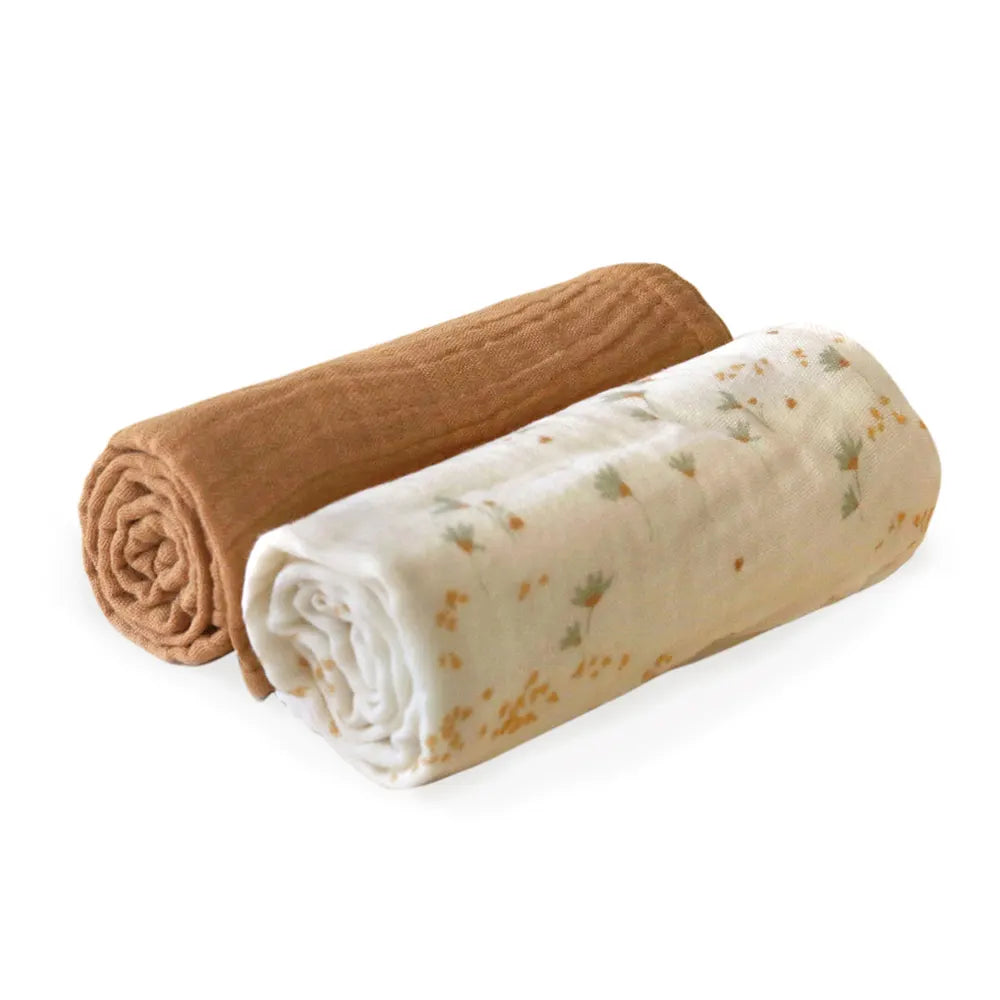
Julie: After lengthy discussions and having explored more than 10 years of Season Paper patterns, we ultimately chose a timeless and poetic pattern, Mouvement. We reworked it in autumnal hues — deep and soft yet full of character — a warm, natural brown/fawn. It is ideal for brightening a space, bringing warmth and light to a neutral, pale room. It pairs easily with a wide range of colours, whether bold and striking or pastel and subtle. We wanted a pattern that was neither childish nor too figurative. It leaves room for the imagination and can work in any interior.
Mélissa: We wanted a print you never tire of, full of soft curves and above all with the "hand-drawn" touch that is Season Paper's hallmark. A print that could easily fit into a modern interior. This Mouvement print has been very successful in our collections, so it felt only natural to see it grace a beautiful Charlie Crane collection.

If you were to decorate a newborn's room, what would you do?
Julie: Neutral, light tones for brightness, natural and soft materials, vintage furniture. Newborns make me want to strip everything back and return to the essentials. But babies grow up fast! And that's when colour can joyfully make its entrance with very colourful objects and pieces.
Mélissa: Ah, that's a very current topic for me. I want to create a little protective cocoon for a newborn, letting them discover the world gently. The choice of materials is therefore very important — the softest cotton, fleece, pale wood, all kept fairly pared back. You make the most of it at the beginning. It's the moment when you can truly decide what the room will look like… before the Snow Queen takes over against your will!
In terms of décor, are you more of a mix and match or a single colour/single print person?
Thomas: As time goes on, I find myself appreciating boldness in décor more and more: mixing patterns and colours inspires me enormously. But when my children were small, I favoured soft, luminous tones and a soothing, almost minimalist atmosphere. It is also this cosy, pared-back spirit that drives Charlie Crane. Each time, our collaborations allow us to explore new horizons, offering prints that are more colourful or more arty, like those in this capsule with Season Paper — a nod to the world of Henri Matisse. It is always a wonderful opportunity to add a more confident touch to our universe while remaining true to our identity.
Julie: It's all or nothing! Either no print at all, or I simply can't stop. I design so many patterns and have so many around me that after a while it starts to hurt the eyes. So I need calm spaces in the house. But what I love about patterns is being able to combine them, juxtapose them, watching colours blend and vibrate together. A single pattern is never enough for me.
Mélissa: It depends on the use! I would say mix and match for the little ones' clothing to create slightly wild looks, but when it comes to décor I don't mix much — I like the idea of one statement print paired with beautiful block colours and well-considered combinations of materials.
As an expert in beautiful things, how would you advise combining children's décor with décor for adults?
Julie: Not really any décor as such at ours… It's more a matter of materials, light and a few well-chosen pieces of furniture — a mix of vintage and iconic design pieces. And while we tend towards minimalism in our choices, that certainly doesn't apply to our children! In principle, our children's rooms are quite understated — white walls, ecru carpet and second-hand furniture — so that they can let their imagination and creativity run wild! The result is rooms full of primary colours and drawings stuck on the walls, where wooden objects and all manner of flashy toys coexist. There are also artworks (lithographs, photographs, drawings) and light fittings that were once in other rooms of the house and have since migrated to their rooms. Not to mention their toys, which frequently end up in the living room. In the end, there is really no distinction between children's décor and adult décor — everything ends up mixing together and it's all rather lively and joyful.
Mélissa: I would say you need to create a fairly "neutral" base that can easily evolve over time as tastes change quickly. Children's rooms (and the parents' living room) are quickly overrun with toys, colours and clutter. It's lovely but it can be a bit overwhelming. The key is to have practical, well-thought-out storage everywhere so you can quickly tidy up when things get out of hand! And don't overthink things in terms of adult and children's décor — simply choose materials, colours and shapes carefully to create a harmonious overall look. Also, depending on children's personalities, you don't always want the same things; décor as a parent is a constant work in progress.
What other Charlie Crane creations can be mixed with this collaboration? (H3)
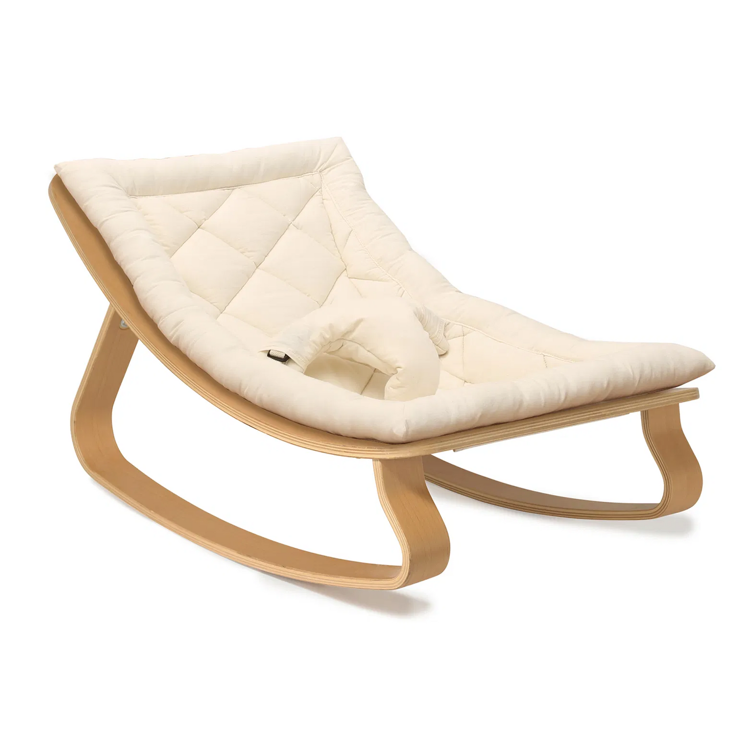
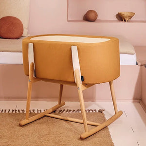
Thomas: The Mouvement print from Season Paper fits perfectly into our existing palette, particularly thanks to its camel tone, which matches the same shade as our collection. If you fall for the KUKO x Season Paper Moses basket (my personal favourite from the collab!), you can easily pair it with the LEVO bouncer in the camel version for a softer, more harmonious look. For a bolder touch, the print also pairs beautifully with our nude — a warm, deep colour.
What are your favourite Charlie Crane products?
Julie: The LEVO bouncer. For me, it has become an iconic design piece. A shame I no longer have a child young enough for a bouncer, as I can perfectly picture it in my living room.
Mélissa: Team LEVO bouncer here too — it really is the signature piece of Charlie Crane. I love its very clean base and the fact that you can change the cover along the way!
Thomas, which Season Paper wallpaper would you choose for an elegant, minimalist, cosy room and for a children's room?
For an elegant room, I would go for the mother-of-pearl wallpaper, with its art deco inspirations. For a minimalist look, I would choose a graphic wallpaper, such as the Season Paper x Heju collaboration. Fancy a cosy touch? I adore the birds wallpaper, which is one of my personal favourites from the Season Paper collection. It makes you want to stay home just to admire it. For the kids' room, I love their dachshund wallpaper — fun without being saccharine.
The Charlie Crane team


